

Why Your Mobile Rankings Differ From Desktop (and the 3 Patterns That Tell You What to Do About It)

I had a page on Keywords Everywhere ranking at position 7.8 on Google for the query "youtube search volume."
Page 1. Just inside the click zone. Felt good.
Then I added a device filter to the same Search Console report and the mobile row showed up at position 14.1.
Same query. Same site. Same week. Page 1 on desktop. Page 2 on mobile.
The first thing I assumed was that mobile was just noisier. Sometimes GSC's mobile position bounces around for low-impression queries. But this one had 444 mobile impressions over 28 days. Plenty of data. Not noise.
So I started looking. And once I started looking at every keyword we track across our portfolio of sites with a device filter on, the pattern got harder to ignore.
About a third of our keywords have a meaningful difference between mobile and desktop ranks. Some of them are signal. Most have a fix. A few are signal in the opposite direction, meaning we're actually doing better on mobile and shouldn't touch them. And about 6% are a different kind of problem entirely, one most people never realize they have.
This article walks through what's actually happening, how often it happens (with real numbers from our own properties), the 3 patterns the gap can take, and what to do about each one. It assumes you have Google Search Console connected and 10 minutes to spend on it. No paid tool required.
- Mobile and desktop SERPs are now genuinely different SERPs. They share most of the ranking signals but not all of them, and the differences are big enough to matter for nearly a third of queries.
- Across 4,792 keywords on our portfolio of sites, 32% had a position gap of 3 or more between mobile and desktop. 17% had a gap of 5 or more. 4% had a gap of 10 or more.
- Most gaps (62%) favor desktop, meaning the site ranks worse on mobile than on desktop. Almost all of those are fixable, and many are caused by one slow image or one intrusive banner.
- The trap most people miss: about 6% of queries have Google serving a different page from your own site on mobile than on desktop. That looks like a ranking gap in your dashboard but it's actually a URL problem.
Why mobile and desktop SERPs are now different
Google rolled out mobile-first indexing years ago and a lot of writers took that to mean mobile and desktop rankings are the same number now. They aren't, and they were never going to be.
Mobile-first indexing means Google uses the mobile version of your page to decide what your page is about and how it should rank. It doesn't mean Google then ranks that page identically on both devices. Once Google has indexed the page, it can and does rank it differently for mobile users than for desktop users, based on signals that differ by device.
There are four big reasons the rankings diverge:
Different SERP features stack differently. Google shows different things in mobile and desktop result pages. The local pack expands and contracts. People Also Ask boxes appear in different positions. Knowledge panels collapse on mobile. Video carousels show on one and not the other. Even when the underlying ranking is the same, the position you appear in shifts because what's above you is different.
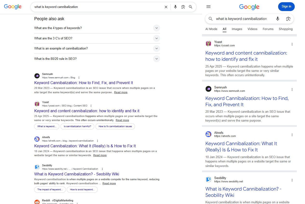
Look at what sits above the first organic result on each side. The feature stack is so different between devices that even identical organic positions translate into very different real positions on the screen.
Different click and engagement signals. A mobile user thumb-scrolling through results gives Google different behavior data than a desktop user who hovers, opens results in new tabs, and reads several before clicking. Pogo-sticking patterns are stronger on mobile because mobile users back out of bad results faster. These behavior signals feed back into ranking.
Different page experience weighting. Core Web Vitals are measured per device. A page can have great Largest Contentful Paint on desktop wifi and terrible LCP on a mid-range Android over 4G. Google sees both numbers and applies them to the corresponding device ranking.
Different intent. Mobile searches have heavier local intent (people on the go), more voice-driven phrasing, and a higher share of brand and navigational queries. The same keyword string can map to genuinely different user intents on the two devices, and Google ranks accordingly.
The practical takeaway: when you see your mobile rank and your desktop rank as different numbers in Search Console, neither one is "wrong." They're both correct, for different audiences seeing different SERPs.
How big is the gap, really?
I pulled the numbers from our own portfolio of sites to give a baseline. The eight sites include keywordseverywhere.com, websiterankingchecker.com, keywordfinder.io, keywordkeg.com, hashtaggenerator.net, domcop.com, keywordclustering.net, and one or two others. Together they get a meaningful slice of search traffic across the SEO and keyword research space.
For the last 28 days, I looked at every keyword that had at least 50 impressions on both desktop and mobile (that floor is enough to filter out single-impression noise). That gave me 4,792 keywords to compare.
Here's what the device gap looks like across those keywords:
| Position gap between desktop and mobile | Share of keywords | What it means |
|---|---|---|
| 0 to 2 positions | 68% | Normal noise. Don't act on it. |
| 3 to 4 positions | 15% | Worth a look. Probably one fixable thing. |
| 5 to 9 positions | 13% | Real signal. Diagnose it. |
| 10+ positions | 4% | Something structural is wrong. Investigate. |
A few things stand out.
Most queries (about two thirds) don't have a meaningful device gap. The day-to-day variance Google's algorithm shows on the same query, same device, accounts for almost all of the small differences you see. If you're acting on every 1-position mobile-vs-desktop difference, you're acting on noise.
About a third of queries do have a gap big enough to matter. That's not a small number. If you track 100 keywords, somewhere around 32 of them have a real device divergence right now.
Of the meaningful gaps, 62% favor desktop: the site ranks worse on mobile than on desktop. The remaining 38% favor mobile. So when there's a real gap, the most common case is "we're losing rankings on mobile compared to desktop."
There's also a subtler stat worth mentioning. At the extreme end of the distribution (10 or more positions of gap), the split is closer to 50/50, with 57% favoring desktop. Big gaps are less directional than small ones. When mobile rankings tank badly, they tank by a lot.
The median absolute gap across all 4,792 keywords is 1.78 positions. The 75th percentile is 3.74 positions. The 90th percentile is 6.67. So if you ever see a 7-position gap on a single keyword and you're wondering whether that's normal: it's at the 90th percentile. Worth investigating.
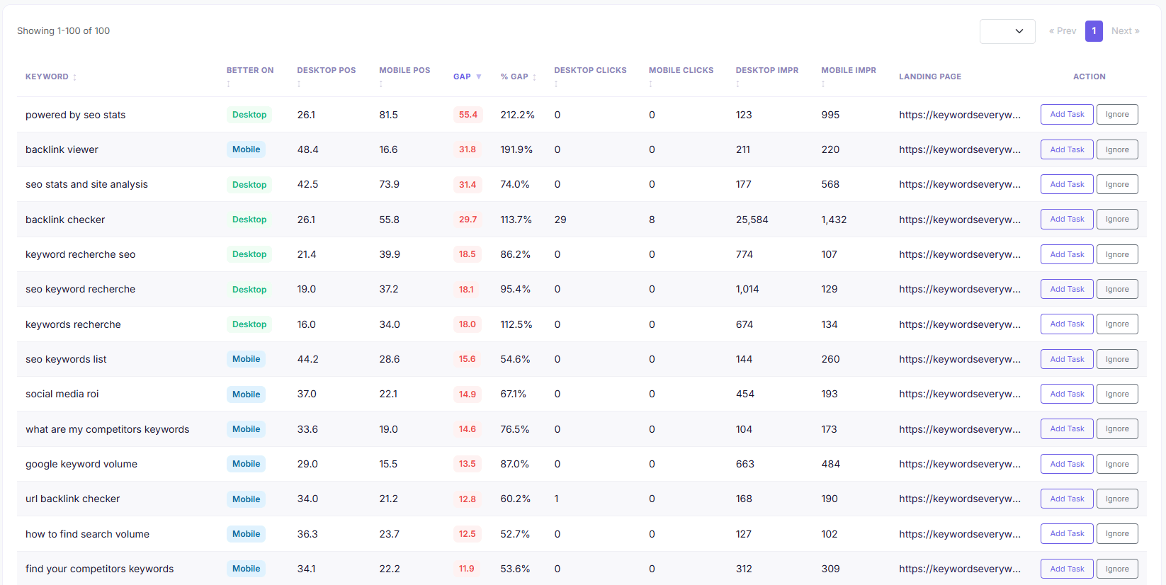
Each row here is one of the 32% of keywords with a meaningful device gap. Sort by gap descending and start at the top, those are the rows that hurt the most.
Want this view across your own keywords? Our Device Ranking Gap report runs this comparison automatically for every keyword you track, daily. It's free for Keywords Everywhere users.
Pattern 1: Desktop ranks better than mobile
This is the most common pattern. About 62% of meaningful device gaps look like this. The page ranks well on desktop and struggles on mobile.
The "youtube search volume" example I opened with is a clean Pattern 1: position 7.8 on desktop, position 14.1 on mobile. The page sits on page 1 for desktop users and falls into page 2 for mobile users. The difference in click-through between position 8 and position 14 is roughly 3x, so on top of mobile getting about half the impressions desktop does, the desktop traffic is also higher-converting per impression.
Pattern 1 usually has one of three causes, in roughly the order of how often I see them:
The page is slow on mobile. Your hero image is 1.4 MB and your desktop wifi loads it in 200ms while a mid-range Android on 4G takes 2.8 seconds. That's a real Largest Contentful Paint hit and Google applies it to your mobile ranking but not your desktop ranking. PageSpeed Insights' mobile tab will surface it. Lighthouse's mobile audit will too. This is the most common fix and often the easiest, sometimes literally one image compression.
Something intrusive is loading above the fold on mobile. Cookie banners that cover half the screen. Newsletter popups that fire on scroll. Sticky headers that occupy 30% of the visible viewport. Google penalizes intrusive mobile interstitials harder than desktop, so an interstitial that's only mildly annoying on a 1920 wide screen can be ranking-degrading on a 390 wide screen. Open your page on your phone, look at what shows up in the first second, and then ask: would a stranger looking for an answer to this query be willing to wait through that?
The text rendering is wrong for mobile. Your CSS says 16px font but on a 320px viewport with the wrong meta viewport tag, the rendered font reads as 11px. Or your line-height is set tight for desktop reading and looks cramped on mobile. Or your paragraphs are 6-sentence blocks that read fine on a wide screen and turn into walls of text on a phone. Mobile readers scan; desktop readers read. Pages that don't adapt to scanning get punished on mobile-only.
There's a fourth, less common cause that's worth knowing about: the page just doesn't have the content depth that mobile competitors have. This is the structural case. Your competitors who rank well on mobile have shorter intros, a visible table of contents, FAQ schema, and a clear answer in the first 50 words. You have a 400-word intro that argues why the topic matters. The mobile reader bounced before you got to the answer. The fix here isn't UX, it's content structure. Look at the top mobile result for your query specifically (not the top desktop result) and audit the difference.
How to tell which cause is yours:
Run PageSpeed Insights on your URL with the mobile tab selected. If LCP is over 2.5 seconds or CLS is over 0.1, your fix is most likely cause #1 (speed) or cause #2 (interstitial). Both will show up there.
If PSI says your page is fine on mobile and the gap is still there, you're probably in cause #3 (rendering) or cause #4 (content structure). Open the page on your actual phone, not Chrome's device emulator, and read it the way a user would. The problem will usually be visible within 5 seconds.
One more thing worth flagging. The brafton.com article on mobile keyword rankings, which currently ranks well for this topic, recommends responsive design as the fix. Responsive design is necessary but it isn't the fix for Pattern 1. You can have a perfectly responsive layout and still rank worse on mobile because of any of the four causes above. Don't stop the diagnosis at "we're responsive."
Pattern 2: Mobile ranks better than desktop
This is the counterintuitive pattern. About 38% of meaningful gaps look like this: the page ranks better on mobile than on desktop.
A good example from our data: the query "instagram keywords." Position 22.1 on desktop, position 14.3 on mobile. That's a 7.8-position gap in mobile's favor. The pattern reveals itself in the impression data: 395 desktop impressions versus 1,195 mobile impressions. Mobile is getting three times more search volume than desktop because Instagram is a mobile-first platform and users searching about Instagram keywords are mostly on mobile.
The first question to ask when you see Pattern 2 is: do I need to fix this?
A lot of the time, no. Some queries are mobile-first by intent. "Restaurants near me," "instagram keywords," "voice search" queries, anything related to apps, anything tied to a mobile platform: these are queries where the actual searcher is overwhelmingly on a phone. If you're ranking well there and losing on desktop, you may be optimizing for exactly the right audience without realizing it. Trying to "balance" your rankings between devices is the wrong goal in this case.
When Pattern 2 IS a problem:
You're cannibalizing local pack inclusion. Sometimes mobile-better rankings on a local query indicate that your page is winning the organic mobile slot but the local pack above it is taking all the clicks anyway. Compare impressions to clicks; if mobile impressions are high but clicks are flat, you're being shown but not clicked because the local pack is eating the conversion.
Your desktop site is the actual broken one. This is more common than people expect. You're ranking well on mobile because your mobile site is fast and clean. Your desktop site has bloat: a 4 MB hero image, a 6-column footer with 200 links, three chat widgets that fire on load. You haven't noticed on your fast desktop connection. Run PSI on your desktop URL. If your desktop LCP is over 2.5 seconds, you have your fix.
Your mobile-first content doesn't translate to desktop intent. If your page is built for a thumb-scrolling mobile user (lots of headings, very short paragraphs, big tap targets), it may read as thin or skimmable on desktop. Desktop users searching the same query might want a more in-depth treatment, and your competitors are providing it. The fix is a content audit specifically against the top desktop result for that query.
The rule for Pattern 2 is: don't reflexively try to fix it. Confirm there's a real problem before doing anything. The default action is to leave it alone and treat the mobile-better ranking as a feature.
Pattern 3: Google shows a different page on each device
This is the pattern almost no one writes about and most people never realize they have. About 6% of queries with meaningful impressions on both devices show this pattern in our data.
It works like this: you have two pages on your site that both target the same query. Google looks at the desktop SERP and decides one page is the right answer. Google looks at the mobile SERP and decides the other page is the right answer. The same query, the same site, two different landing pages depending on what device the user is on.
A real example from our data. The query is "backlink checker." On desktop, Google ranks our blog post about the topic, at keywordseverywhere.com/blog/best-free-backlink-checker-page-level-bulk-reports/. On mobile, Google ranks our dedicated tool page, at keywordseverywhere.com/backlink-checker.html. Same query, same site, different pages. The desktop blog post gets 26,866 impressions; the mobile tool page gets 1,585.
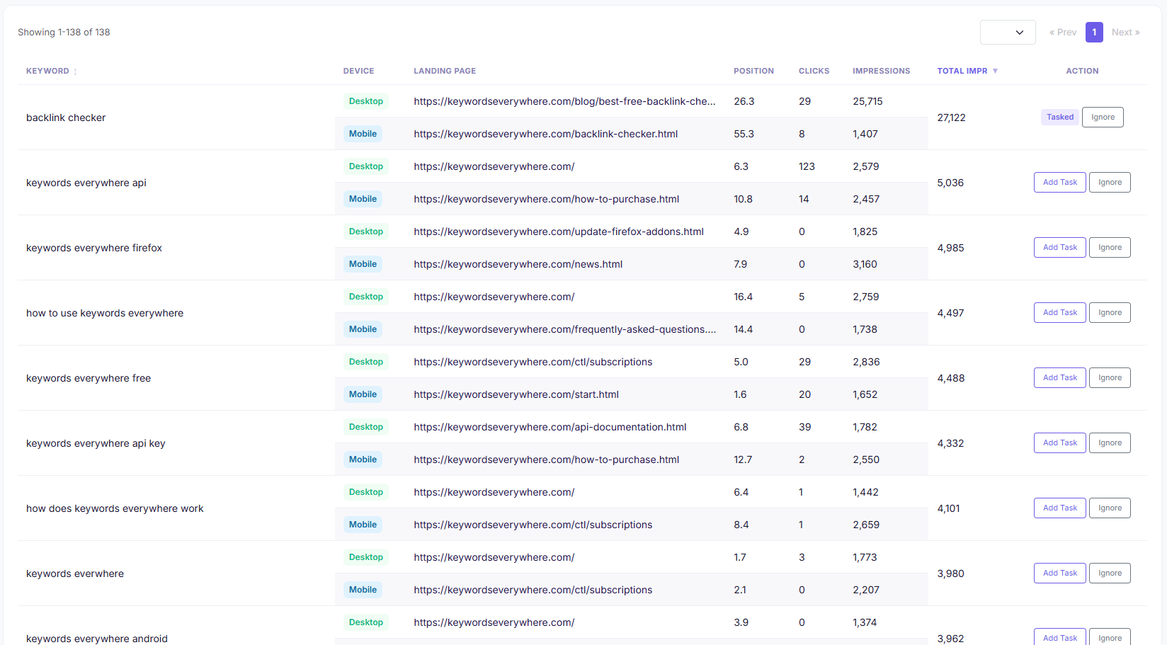
Each row is a query Google answers with a different page per device. The fix is not UX, it is deciding which URL should be the canonical answer for both devices and consolidating or differentiating the other.
Why this happens: when Google sees two of your pages as plausible answers to a query, it picks the one whose signals best match the searching context. Desktop searchers may match better with the blog post (they read articles); mobile searchers may match better with the tool page (they want quick utility). Google's choice can flip per device.
Why it's bad:
Your impression count is split. You're competing against yourself, with each page winning impressions only on the device where Google preferred it. Combine them onto one page and you'd outrank both individual versions in most cases.
The user experience is inconsistent. A user who searches on desktop sees one page, then opens the same link on their phone (or shares it with someone who's on a phone) and gets a different page. They lose their place. Bounce rate goes up.
Internal links get diluted. Every internal link you build to the topic flows to one URL or the other but never both. Authority spreads thin.
It often shows up in your dashboard as a regular Pattern 1 gap. This is the trap. You see "desktop rank 27, mobile rank 56" and you start auditing your page for mobile speed. But the gap isn't a page problem. It's a URL problem. Google is ranking different pages on the two devices, and one of them happens to be worse positioned than the other. UX fixes won't change anything.
How to spot Pattern 3: in Search Console, after you've filtered by query, switch the dimension view to "Pages." If you see multiple pages from your site in the results for the same query, you have at least a partial Pattern 3. Then compare the "Pages" tab between the mobile and desktop device filters. If the top page is different per device, that's Pattern 3 confirmed.
The fix is structural and you have three real options:
Consolidate. Pick the better page (usually the higher-trafficked or higher-converting one) and 301-redirect the weaker one to it. Or canonicalize the weaker to the stronger. You'll lose some impressions on the redirected page in the short term but the consolidated page will pick up combined ranking signals over a few weeks and usually outrank either prior version.
Differentiate. Make each page clearly target a different sub-intent. The blog post becomes about "how to check backlinks" (educational). The tool page becomes about "free backlink checker tool" (utility). Sharpen the title tags, intros, and primary headings to match. Google may settle on serving the right page per intent, which is fine, but you stop competing with yourself.
Accept. Sometimes the split is genuinely correct. The desktop researcher really does want the blog post; the mobile searcher really does want the tool. If both pages convert well in their own context and the impression split doesn't hurt total clicks, leaving it alone is a valid decision.
We have a Device Cannibalization report that runs this comparison across all your tracked keywords daily and surfaces the cases where Google is splitting impressions. It's how I find the worst offenders on my own sites.
Diagnose your own device gap in 10 minutes
You don't need a paid tool to do this once. Google Search Console gives you everything you need. Here's the manual walkthrough.
Step 1. Open Google Search Console and pick the property you want to audit.
Step 2. Click "Performance" in the left sidebar, then "Search results."
Step 3. Set the date range. The default 28-day window is fine, more is just more data.
Step 4. Click the "Device" filter at the top of the query table.
The Device filter has two modes. The default is "Filter," which lets you see one device at a time. What you want is the Compare mode. Click the "Compare" tab inside the device dropdown and pick "DESKTOP" and "MOBILE." Apply.
Search Console will reload the Queries tab showing two rows for every query: one for desktop, one for mobile, with positions and impressions side by side.
Step 5. Sort the table by impressions descending. The queries at the top are the ones where a device gap actually matters because they have the volume to be worth fixing.
Step 6. Scan for queries where the desktop and mobile positions differ by 3 or more, and where both rows have at least 50 impressions.
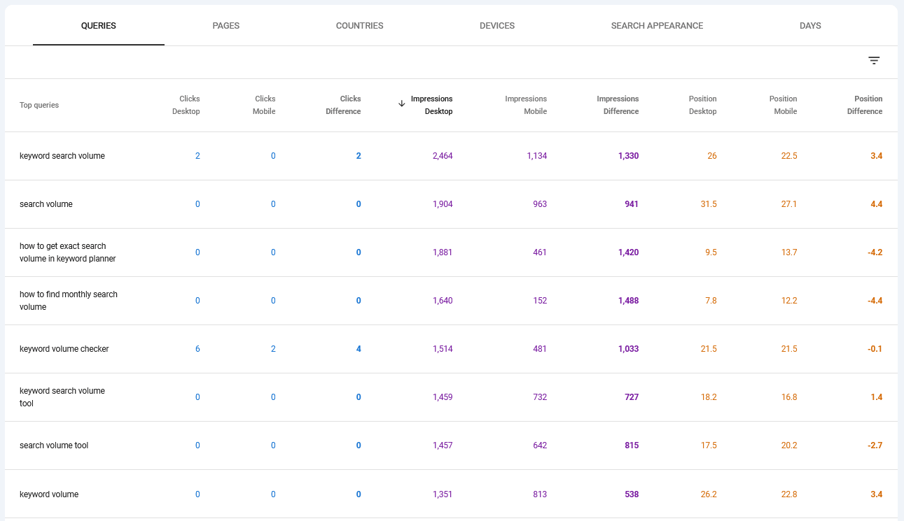
Sort by impressions descending so the queries with real volume surface first. A 5-position gap on a query with 50 impressions does not matter; the same gap on a query with 5,000 impressions does.
Some queries will have a desktop row but no mobile row, or vice versa. Skip those. The comparison only makes sense when there's real data on both sides.
Step 7. For each query with a meaningful gap, identify which pattern you're in.
If desktop ranks better and mobile is worse, you're probably in Pattern 1. Go to the "Pages" tab (with the same device compare still applied) and confirm Google is ranking the same page on both devices. If yes, run PageSpeed Insights mobile and start the speed/interstitial/rendering audit from the Pattern 1 section above.
If mobile ranks better and desktop is worse, you're in Pattern 2. Decide whether you need to fix it (most of the time, you don't).
If the "Pages" tab shows different pages per device for the same query, you're in Pattern 3. URL consolidation or differentiation is the fix.
That's the entire diagnostic. Ten minutes for a small site. Longer for a site with thousands of queries; you'd want to filter to the top 100-200 by impressions and ignore the long tail.
If you'd rather not run this filter manually every week, that's what we automated in Website Ranking Checker. Both the Device Ranking Gap and Device Cannibalization views run this comparison across every keyword you track, daily, and surface only the cases where the gap is big enough to be worth your attention.
Common mistakes when reading mobile rankings
A few mistakes I've made or seen others make.
- Treating the "Average Position" number as a single rank. GSC's average position is an impression-weighted average across every search Google logged for that query in the time period. It's already a distribution, not a rank. A 1-position move in average position can mean a tiny shuffle at the top of the SERP or a small share-of-impressions reweighting. It rarely means "I literally moved one position." For more on this, see how to actually check your website's ranking on Google.
- Comparing devices without an impression floor. If a query has 200 desktop impressions and 4 mobile impressions, the "mobile position" is calculated from those 4 impressions. Whatever number you see is noise. Set a minimum of 50 impressions per device (preferably 100) before comparing. The 4,792-keyword number I quoted earlier already filters at 50.
- Acting on day-to-day device fluctuations. Position 7 today, position 9 tomorrow, position 6 the day after. That's normal noise even on a single device. Layer device on top of that and the noise compounds. For real signal, compare the 28-day average mobile position to the 28-day average desktop position. Don't compare yesterday to today. The noise floor of daily rank tracking is bigger than most people realize.
- Optimizing for AMP. AMP is dead. Google retired AMP requirements from Top Stories in 2021 and stopped favoring AMP pages entirely in 2024. If you still have an AMP setup that's diverging your mobile experience from your desktop experience, retire it. Mobile-friendly responsive HTML is the answer. Strong recommendation: if your mobile rankings are persistently worse than desktop and you have legacy AMP pages, that's a likely cause.
- Forgetting tablet. In 2026, tablet is around 3% of searches. For most sites you can safely bucket tablet with desktop (Google does too, in most categories). The only exception is sites with heavy iPad-specific audiences (some media, some games). For most diagnostics, ignore tablet entirely and focus on the desktop-vs-mobile split.
- Fixing the page when the fix is the URL structure. I touched on this in Pattern 3 above, but it's worth repeating. If you have two of your own pages targeting the same query and Google is splitting them per device, no amount of speed optimization or content rewriting on either page individually will close the gap. The fix is a structural decision about which URL should be the canonical answer.
FAQ
- Should I track mobile and desktop rankings separately?
- Yes, if you care about the actual user experience. About a third of your keywords will have meaningful position gaps between devices that get averaged out in the aggregate "All devices" view. Tracking them separately is the only way to see Pattern 1 (mobile speed issues), Pattern 2 (desktop bloat), and Pattern 3 (URL splits). The "All devices" view is fine for a quick health check but it hides the actionable signal.
- How much position difference between mobile and desktop is normal?
- Across our data, the median gap is about 1.8 positions and 68% of keywords have a gap of 0-2 positions. Anything in that range is noise and not worth acting on. A 3-4 position gap is at the 75th percentile and worth a look. A gap of 5 or more is real signal and you should diagnose it. Gaps of 10 or more are unusual (top 10% of cases) and almost always indicate something structurally wrong.
- Does mobile-first indexing mean my mobile and desktop rankings should be identical?
- No. Mobile-first indexing means Google uses your mobile content to decide what your page is about and how it should rank. Once that decision is made, Google still serves rankings differently on each device based on device-specific signals like Core Web Vitals, SERP feature stacking, and click behavior. Mobile-first indexing was about which version of your page Google reads, not about whether the rankings then come out the same.
- Why does Google show a different landing page on mobile vs desktop?
- When Google sees more than one of your pages as a plausible answer to the same query, it picks one based on which page's signals best match the searcher's context. Desktop and mobile searchers can have different contexts (longer reading sessions vs quick utility, more local intent on mobile, different click patterns), so Google can pick different pages for them. We call this device cannibalization and it affects about 6% of queries with meaningful impressions on both devices.
- Is it worse to rank well on desktop and poorly on mobile, or the reverse?
- Depends on your audience. If your users skew mobile (consumer apps, social media tools, anything tied to a mobile platform), ranking worse on mobile is the bigger problem because that's where your buyers are. If your users skew desktop (B2B, productivity tools, technical content), the inverse. Look at your overall device split in GSC: if 70% of your impressions are mobile, fixing Pattern 1 (desktop-better, mobile-worse) is your priority.
- Should I make a separate mobile site for SEO?
- No. Separate mobile sites (m.example.com setups) are a 2015 pattern. Responsive design has been the recommended approach since Google's mobile-friendly update in 2015, and a separate mobile site now usually creates more problems than it solves (URL fragmentation, canonical issues, sometimes duplicate content). If you still have a separate mobile site, the long-term move is to migrate it to a responsive design on the main domain.
- How does Google measure mobile-friendliness in 2026 (post-AMP)?
- Through Core Web Vitals (Largest Contentful Paint, Cumulative Layout Shift, Interaction to Next Paint), the Mobile Usability portion of the page experience signal (no longer a separate report in GSC, folded into Core Web Vitals), and behavior signals derived from how mobile users actually engage with your page. The cleanest single check is PageSpeed Insights with the mobile tab selected. If you pass that, you pass most of what Google cares about for mobile-friendliness.
Spot mobile vs desktop ranking gaps automatically
Website Ranking Checker connects to your Google Search Console and surfaces every keyword where mobile and desktop rankings diverge, plus every case where Google serves a different landing page per device. Daily. Free for Keywords Everywhere users.
Check my rankings free